Build Custom Web Performance Dashboards
Our custom dashboards feature lets you build dashboards showing the data that matters to your team. You can combine synthetic test results, Google CrUX data, and real user analytics in one place.
How to create a custom dashboard
- Select Dashboards in the sidebar
- Click on Custom
- Click on Add Dashboard
Add charts to the dashboard
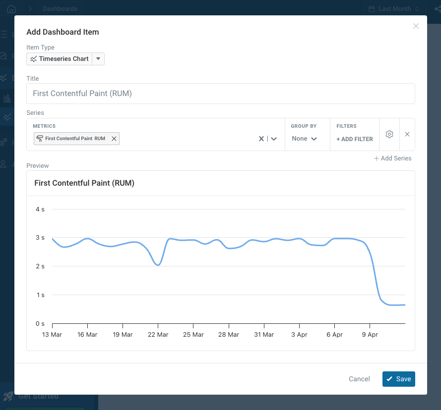
After creating a dashboard, you'll be prompted to add the first chart.
You can configure:
- The type of dashboard item (for example a timeseries chart, bar chart, or table)
- What metrics to display
- How data should be filtered
- Whether to group data by test or page view properties
Edit dashboards
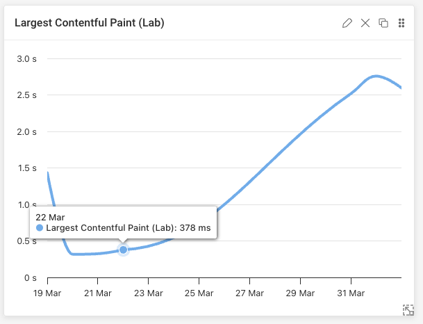
Hover over each dashboard item to see editing options:
- Click the pencil icon to change what the item displays
- Drag the item by clicking and holding the six dots
- Resize the item using the bottom right corner
Item types
You can add different types of dashboard items to visualize your web performance data.
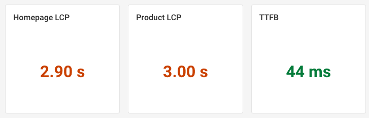
Metric
This item type displays a single metric value.
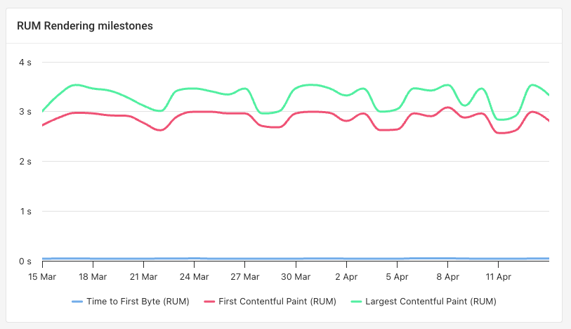
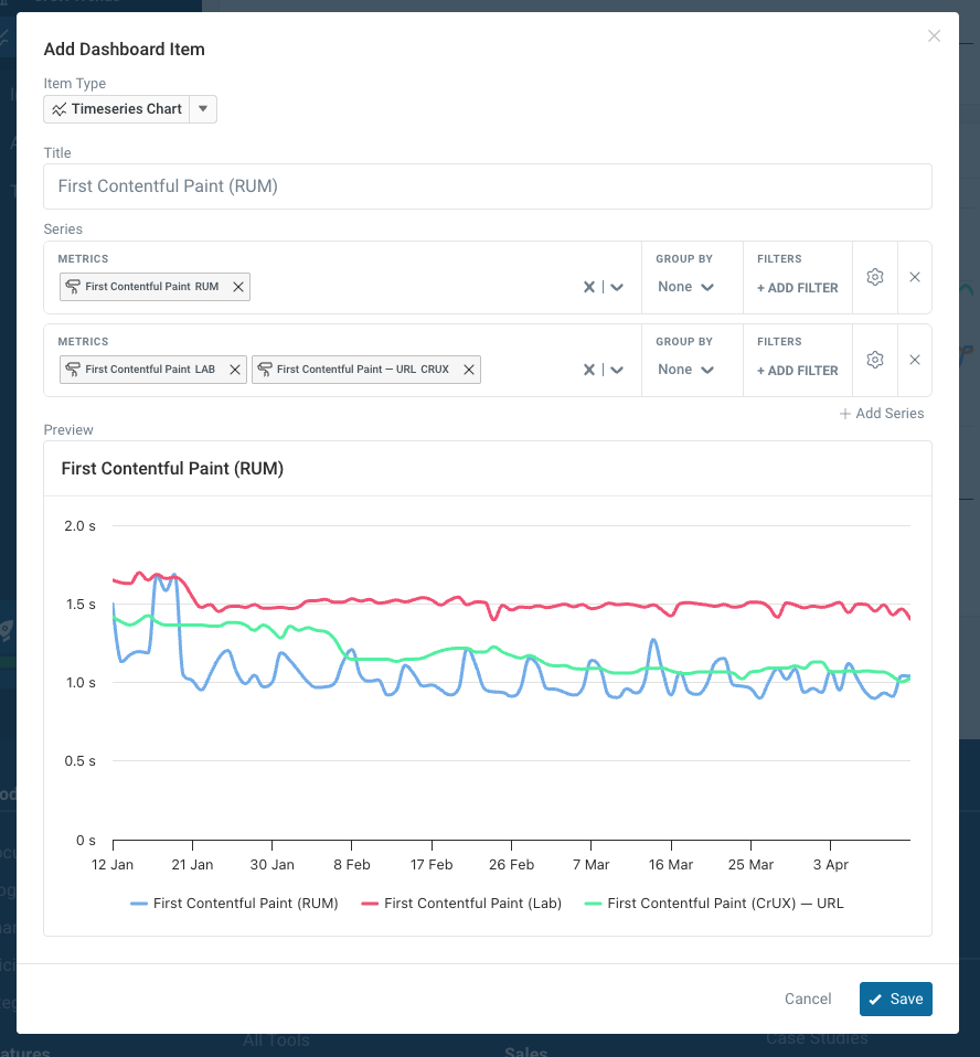
Timeseries Chart
This item type shows how a metric has changed over time. You can add multiple series to the same chart to compare data from different sources, or break data down by device type, page view country, and other properties.
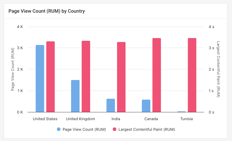
Bar Chart
Compare different metrics across different segments of your visitors or synthetic tests.
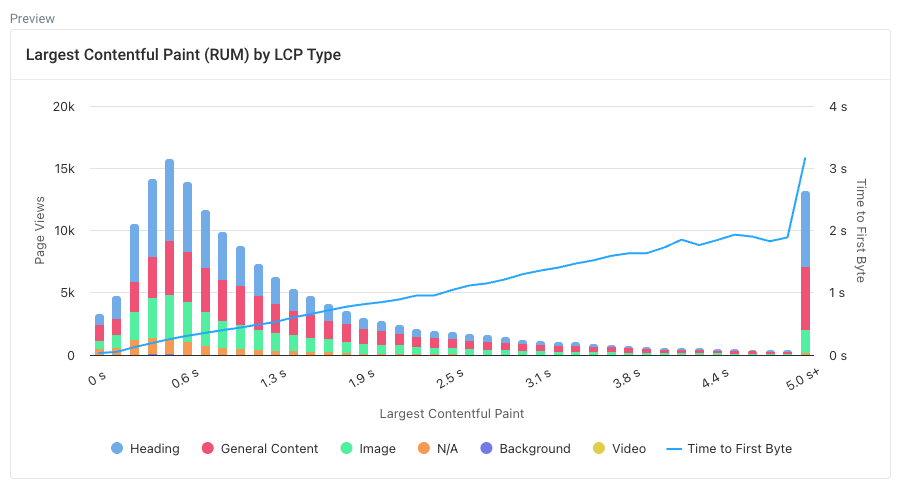
Histogram
Histograms show how a metric is distributed. For example, you can see how many visitors have a fast experience and how many wait a long time for page content to show up.
Add additional metrics to see how they correlate with the first one. For example, you can see to what extent server response time determines the Largest Contentful Paint metric.
Group each data bucket by a property like device type or country to see how those factor vary across buckets.
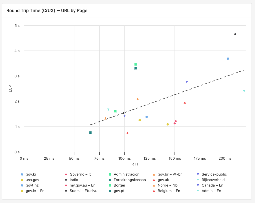
Scatter
Plot two metrics against each other to explore how they correlate.
For example, this screenshot shows the CrUX network round trip time (RTT) and the CrUX LCP metric. You can see that websites load slower when visitors have a slower network. However, some website perform better than expected just based on visitor network speed, while less optimized websites perform worse than expected.
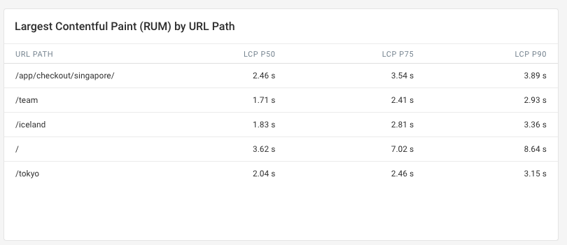
Table
See the exact metric values for different data categories or percentiles.
Text
Add custom text to your dashboard to provide context for the data you're showing.
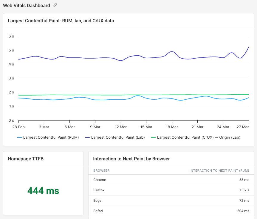
Dashboard example: combine multiple data types
You can add multiple series to show web performance data from multiple sources in one chart.
CrUX data is collected as part of each synthetic test, so you can select it along with your lab test metrics.
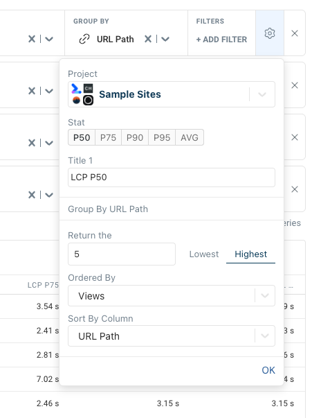
Advanced options: cross-project reports and different percentiles
Click on the gear icon for each series to access advanced options. For example, you can:
- Select what projects the data comes from
- Choose what statistical average should be used
- Configure how the top grouping categories should be determined
If you create a dashboard that covers data from across multiple projects, all users with access to the current project will be able to access the dashboard, but data won't load for them if they don't have access to all projects.
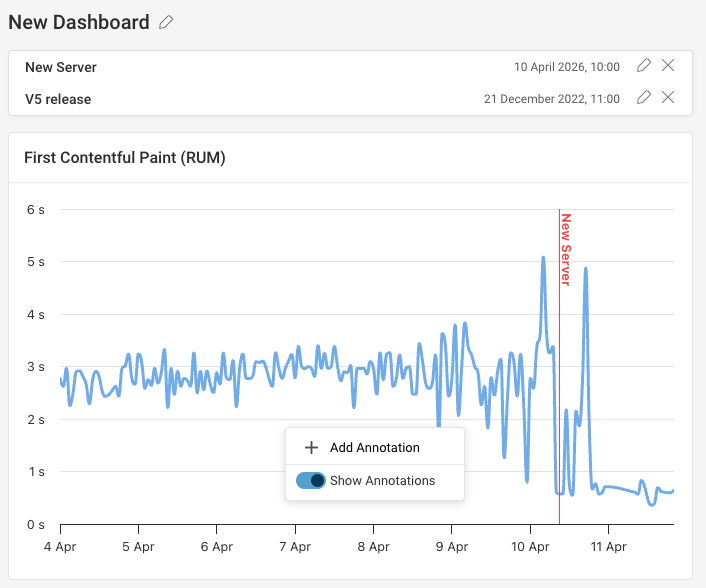
Add chart annotations
To mark specific events on your chart, right-click on it to add an annotation.