
Deferring offscreen images is a web performance optimization technique that can help you improve user experience and Core Web Vitals on your site. Also known as lazy loading, it downloads out-of-view images only when they're about to appear in the user's viewport. It's especially important to defer offscreen images on image-heavy websites.
In the past, lazy loading was a complicated process that involved either the manual setup of JavaScript event listeners along with viewport calculations or the integration of a third-party library. However, with the introduction of the loading HTML attribute, the situation has improved a lot, as it provides a performance-friendly way to defer offscreen images.
What Does 'Defer Offscreen Images' Mean Exactly?
Offscreen images are not visible within the browser viewport, such as content located below the fold, in slide-out panels, dropdown mega menus, image carousels, or other out-of-view locations.
When a user lands on the page, it's still unknown which offscreen images they'll see and which ones they won't, as this depends on individual user behavior. For example, whether they scroll the page down, click through a slider, open the slide-out menu, or perform another action:
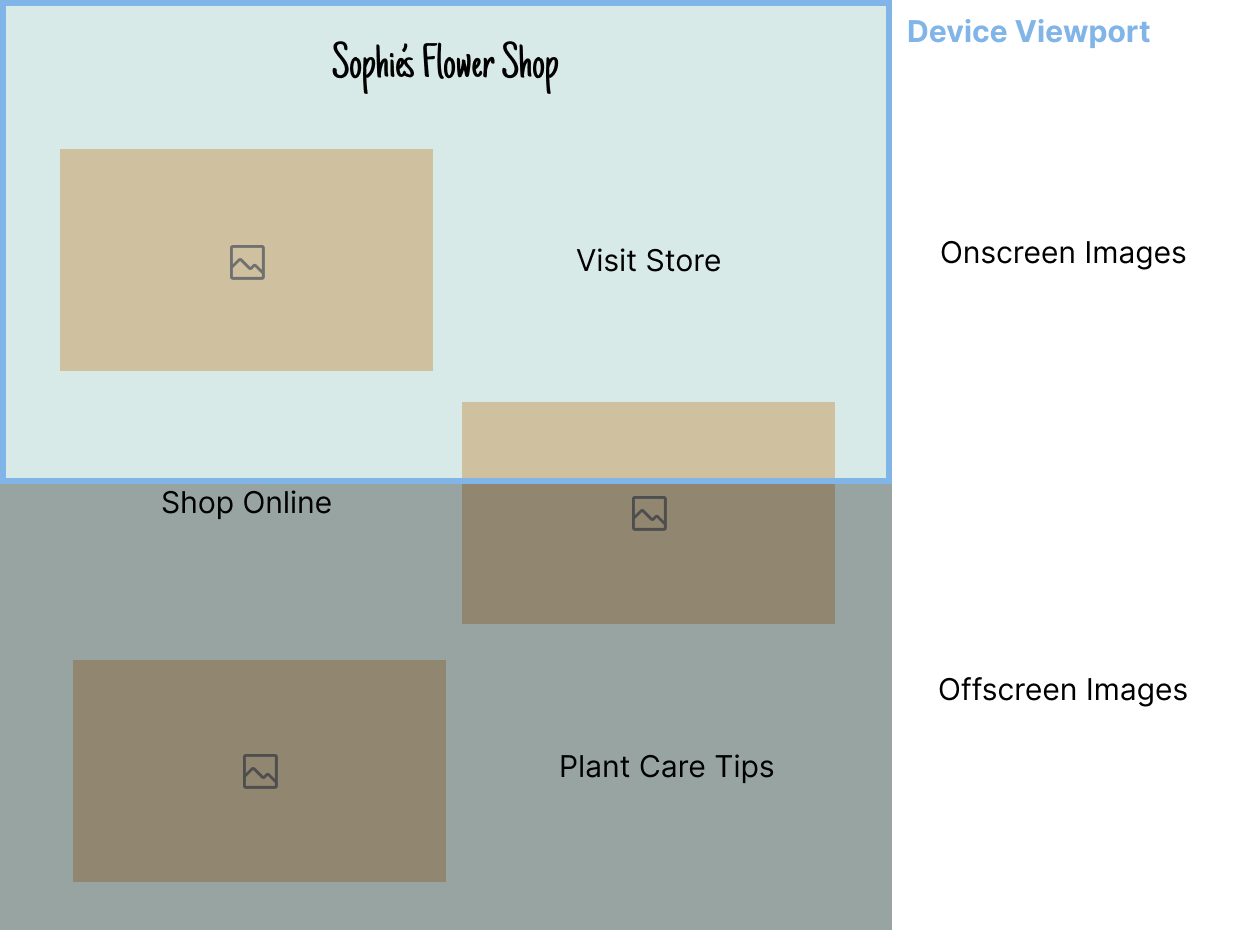
As offscreen images are not critical resources, for optimal web performance results, the browser should only start downloading them shortly before they enter the viewport.
How Does Deferring Offscreen Images Improve Web Performance?
Deferring non-critical resources is generally a good idea to improve web performance because critical resources can load faster and the browser can render above-the-fold content sooner. In addition to images, you can also defer other types of resources, such as JavaScript and CSS files.
As lazy loading offscreen images speeds up page load time, it can also improve Web Vitals affected by page load time, such as First Contentful Paint (FCP), Largest Contentful Paint (LCP), and Interaction to Next Paint (INP).
Can Deferring Offscreen Images Hurt Web Performance?
If you defer offscreen images, there are two important things to pay attention to, as they can hurt web performance and user experience:
- Don't forget to add the
widthandheightattributes to the<img>element, as lazy loaded images may push other content elements aside if their dimensions are not defined, which can result in unexpected layout shifts and hurt your Cumulative Layout Shift (CLS) scores. - Don't lazy load above-the-fold images. Doing so can be especially harmful if you defer images that are candidates for the Largest Contentful Paint element on the page (Lighthouse even has a flag that warns users not to lazy load the LCP image).
How Do Offscreen Images Load When They Are Not Deferred?
Before moving on to how to defer offscreen images, let's see how images are rendered on the page when they are not lazy loaded.
I created a demo consisting of some flower images displayed in a vertical layout (note that the live version of the demo also includes some text between the images — we'll need this later in the article to run realistic synthetic performance tests).
The screencast video below shows the images and Chrome DevTools' Network tab side by side so that you can see that all images download at initial page load (this is what we'll change using lazy loading):
How Do You Know That You Should Defer Offscreen Images on Your Page?
Web performance analysis tools, such as Lighthouse and DebugBear, show a flag or recommendation when you have offscreen images on the page, and deferring them could improve your Web Vitals and other metrics.
Lighthouse Performance Audit
Google's Lighthouse tool (you can access it from Chrome DevTools' Lighthouse tab) shows a Defer offscreen images performance audit along with the potential savings in kilobytes and a list of the offscreen images present on the page:

Lighthouse explains that the page will finish loading more quickly if less data is loaded during the initial page load:
Consider lazy-loading offscreen and hidden images after all critical resources have finished loading to lower time to interactive.
DebugBear's Web Performance Recommendation
DebugBear's Lazy load offscreen images recommendation provides more detailed information than Lighthouse's performance audit, as it shows the suggestion together with a rendering filmstrip (see in the upper part of the screenshot below) and the request waterfall data of offscreen images (see in the lower part of the screenshot below):

Now, let's see how to defer offscreen images using HTML.
Defer Offscreen Images with the loading Attribute
As I mentioned above, lazy loading images used to be a huge hassle. Since the introduction of the native loading attribute, this is not the case anymore.
The loading attribute allows you to define a download strategy for an HTML image or iframe. As it's supported by all modern browsers, you can use it in production without providing a fallback method.
You can add it to your images in the following way (don't forget to include the width and height attributes when lazy loading an image to prevent unexpected layout shifts):
<img src="flowers.jpg" alt="Flowers" width="800" height="533" loading="lazy" />
The loading attribute can take two values:
eager:- The browser sends a download request for the image file to the server when it processes the
<img>tag, so it starts downloading almost immediately. - This is the default value of the
loadingattribute.
- The browser sends a download request for the image file to the server when it processes the
lazy:- The browser starts downloading the image file shortly before it appears in the viewport.
- If the user doesn't move close to the location of the offscreen image (e.g. doesn't scroll the page down or move the cursor towards a slideout panel), the file never downloads.
In addition to the <img> tag, you can also add the loading attribute to <iframe> elements, which can be useful if you want to publish multiple embeds, such as Codepen pens, on your page.
To learn more about how loading="lazy" works, check out our article on the attribute — in addition to the web performance insights, it includes some useful practical tips too (e.g. how to handle lazy loading if you want to enable your users to access your page content when they're offline).
Here, let's go back to our flower demo and see how it changes when we defer offscreen images.
The code example below shows how to use the loading attribute when there are more images on the page (I didn't add loading="eager" to the first three images, as eager is the default value of the attribute):
<figure>
  <img src="images/flowers-01.jpg" alt="Flowers 01" width="800" height="533" />
</figure>
<figure>
  <img src="images/flowers-02.jpg" alt="Flowers 02" width="800" height="533" />
</figure>
<figure>
  <img src="images/flowers-03.jpg" alt="Flowers 03" width="800" height="533" />
</figure>
<figure>
  <img
    src="images/flowers-04.jpg"
    alt="Flowers 04"
    width="800"
    height="533"
    loading="lazy"
  />
</figure>
<figure>
  <img
    src="images/flowers-05.jpg"
    alt="Flowers 05"
    width="800"
    height="533"
    loading="lazy"
  />
</figure>
<figure>
  <img
    src="images/flowers-06.jpg"
    alt="Flowers 06"
    width="800"
    height="533"
    loading="lazy"
  />
</figure>
To defer offscreen images, you'll need to estimate which images will be visible in the viewport at initial page load. It's important that you don't forget about small-screen devices that are typically used in portrait orientation, so in some cases, more images will be visible within the viewport on mobile than on desktop.
In the screencast video below, you can see that the first five images download immediately, while the other ones only download when the page is scrolled down (see the live version of the demo with deferred images):
You may have noticed that while we added loading="lazy" up from the fourth image, the browser downloaded the first five images at initial page load.
This happens because the attribute makes some estimates about the intersection of the viewport and the location of the deferred image. In this way, the download process can start some time before the offscreen image enters the viewport.
When you add loading="lazy" to an image, the browser instantiates a new IntersectionObserver object to monitor the position of the image relative to the viewport, rather than immediately downloading the image file.
To learn more about how to use the performance-friendly IntersectionObserver API, check out our article on how to lazy load background images with this API.
Show Performance-Friendly Placeholders for Deferred Images
Now let's see how to add performance-friendly placeholders to offscreen images. This is important because users on slower devices or networks still need some kind of visual feedback until the images are rendered to the screen.
There are different strategies for providing placeholders for images that have not downloaded yet. For example, there are JavaScript libraries you can use to show the lo-fi versions of full-size images, such as SQIP and LQIP Modern. As these tools generate super lightweight lo-fi images, they're worth considering if you want to provide more visually appealing placeholders for your images.
However, as these libraries still introduce some performance overhead to the page, let's see how you can add properly sized placeholders to your images using a simple CSS background color (see above for the HTML):
figure {
  display: flex;
  justify-content: center;
}
img {
  max-width: 100%;
  height: auto;
  background-color: #d6d6d6;
}
The above code turns the <figure> elements into flex containers, each of which holds one <img> element.
As a result, <img> becomes a flex item, which means that it'll keep its intrinsic size defined by the width and height attributes in the HTML when the placeholder is shown. In other words, the gray placeholder boxes will display at the same dimensions as the actual images that will load later.
(The justify-content property is only added for styling; you can remove it if you don't want to center the images within the flex container.)
The max-width: 100% and height: auto declarations make the <img> elements responsive so that they won't be wider than the viewport on small-screen devices.
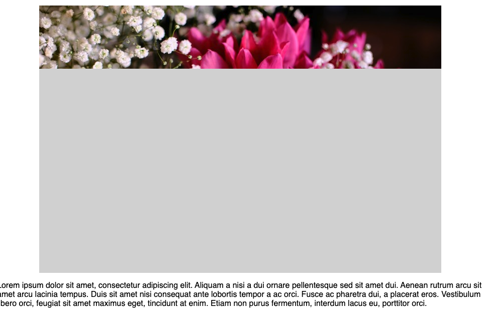
Results of the DebugBear Performance Tests
Now let's run some web performance tests on the non-deferred versus deferred versions of our flower demo. To make the tests more realistic, I tweaked the demos a bit and added some text between the images, which better represents a real-world website.
I ran automated lab (a.k.a. synthetic) tests every four hours over the course of nine days from DebugBear's US East data center, which is one of our 30+ remote test locations. This means 54 (i.e., 6 * 9) tests per demo.
Below, I'll show the time series comparison charts along with an example of a rendering filmstrip comparison, all created with DebugBear.
1. Desktop Results: Non-Deferred vs Deferred Offscreen Images
On the time series comparison charts below, you can see the desktop scores for four key performance metrics:
- Page weight
- First Contentful Paint (FCP)
- Largest Contentful Paint (LCP)
- Lighthouse's Performance score
The blue line shows the non-deferred, while the green line shows the deferred version of the demo on desktop:

According to the time series data above:
- The page weight was significantly lower for the lazy loaded version because the browser didn't have to download the deferred images from the network.
- FCP and LCP were consistently lower for the deferred version throughout the nine test days.
- Lighthouse's Performance scores were about the same for the two demos. Since this metric depends on multiple factors, it's not surprising that the difference stemming from deferring offscreen images didn't change it in a significant way.
Below, you can see the rendering filmstrip comparison from the last automated lab tests DebugBear ran for the non-deferred and deferred demos on desktop, which shows the nominal values of the performance metrics (e.g. the desktop LCP score improved from 641 milliseconds to 574 milliseconds):

2. Mobile Results: Non-Deferred vs. Deferred Offscreen Images
Now, let's see how our demos performed on the series of automated mobile lab tests I ran with DebugBear throughout nine days:

As you can see above, the mobile results are very similar to the desktop ones:
- The page weight significantly shrank when the offscreen images were deferred.
- FCP was a bit lower for the lazy loaded version.
- LCP was significantly lower for the lazy loaded version, and the difference stayed consistent throughout the testing period.
- Lighthouse's Performance scores were about the same.
Below is the rendering filmstrip comparison from the last automated mobile lab tests I ran — as you can see, the mobile Largest Contentful Paint score significantly improved when the offscreen images were deferred (from 2.24 seconds to 1.73 seconds):

Test How Much You Can Improve Your Web Vitals by Deferring Offscreen Images
If you want to test whether you should defer offscreen images on your own site before changing the live code, you can use DebugBear's Auto Experiment feature.
It allows you to run pre-configured experiments for DebugBear's web performance recommendations, such as Lazy Load Offscreen Images, and then compare the performance results of the live page and the experiment.
To use the feature, scroll down to the Recommendations section on the test results page, find the recommendation you want to improve, and click the Run Experiment button:

On the next screen, you'll see the code changes that will be used in the Auto Experiment, e.g. here, DebugBear will add the loading="lazy" attributes to the offscreen images on the page.
If you want to change anything in the auto-generated code, you can edit the HTML document manually. DebugBear may also recommend related page speed improvements that you can add to your experiment (e.g. preload LCP image with high priority in the screenshot below).
You can run the auto experiment multiple times to reduce variability, too (the default setting is 3, meaning that the lab test will run three times and DebugBear will show the median value of the three tests):
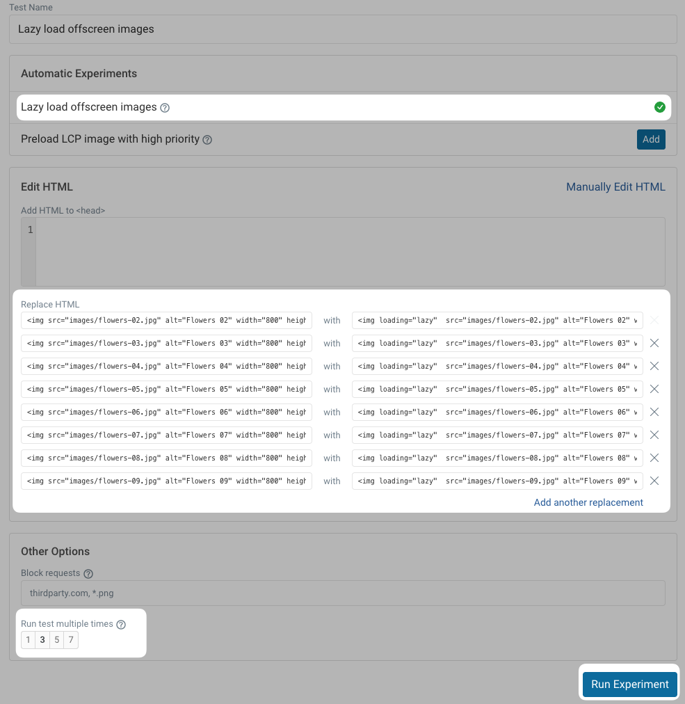
You may need to wait a few minutes for DebugBear to run the tests.
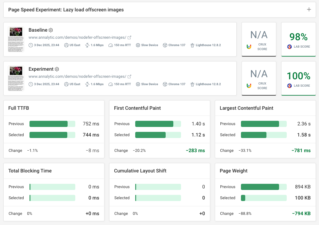
On the test results page, you'll see the performance scores for the live page (Baseline) and the median value of the auto experiments (Experiment) side by side.
As these are synthetic tests, you can also run auto experiments for any other sites, e.g. your competitor's homepage, not just for your own domains.
As the screenshot below shows, DebugBear's Lazy load offscreen images auto experiment has improved all the performance metrics (even Lighthouse's Performance score grew from 98% to 100%):
Summary: How to Defer Offscreen Images
Deferring offscreen images offers significant web performance benefits on both desktop and mobile devices. It enhances the user experience, reduces the page weight, and improves Web Vitals such as First Contentful Paint and Largest Contentful Paint.
In addition to deferring offscreen images, there are other ways to optimize your images for performance, such as using responsive images and next-gen image formats. You can combine those web performance optimization techniques with lazy loading to improve image performance even more.
The most important thing is to detect the web performance issues of your own images, as every website and application is different, and you may always come across surprising findings you haven't thought about before.
Besides setting up synthetic lab tests where you control the test conditions (e.g. device type, location, etc.), you can also use real user monitoring (RUM) to see how your pages perform for metrics that can only be accurately measured on real website visitors, such as Interaction to Next Paint and Cumulative Layout Shift:
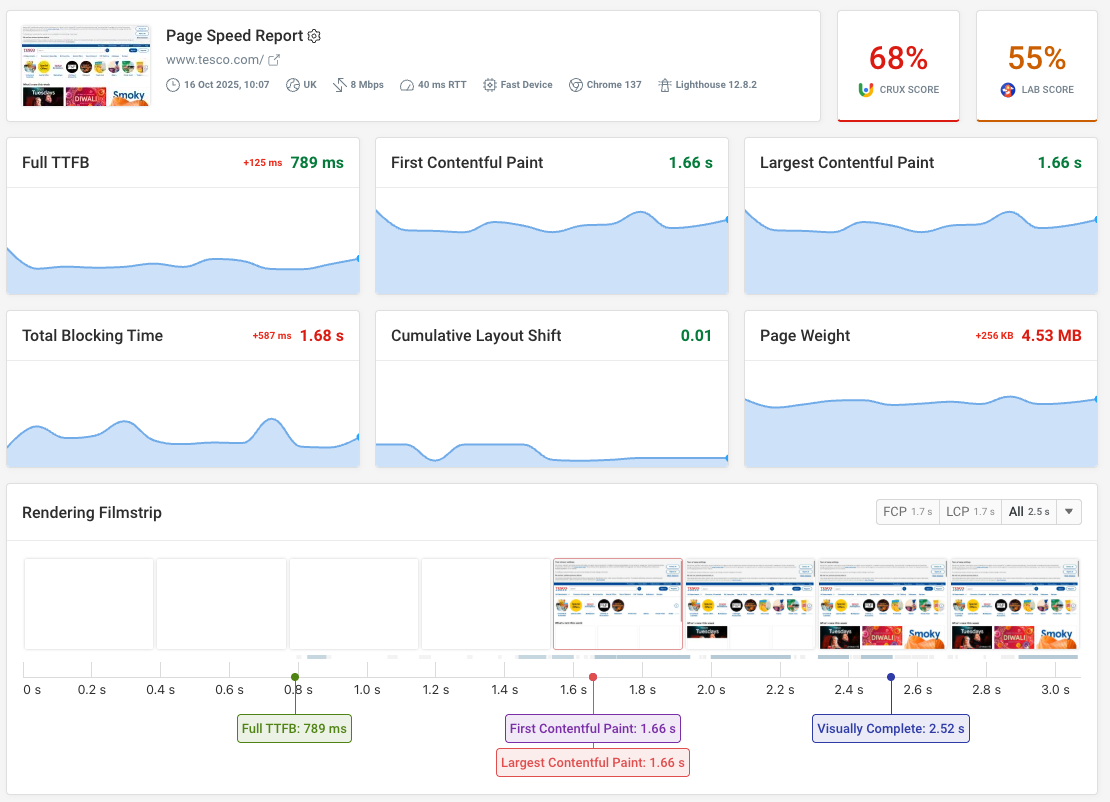
With DebugBear, you can start catching and solving your web performance issues for free.
To do so, run a free website speed test on your most important pages or sign up for our free 14-day trial (no credit card required) to take advantage of all the debugging and monitoring features, including synthetic testing, RUM, detailed Core Web Vitals analysis, long-term CrUX comparisons, and more.
Monitor Page Speed & Core Web Vitals
DebugBear monitoring includes:
- In-depth Page Speed Reports
- Automated Recommendations
- Real User Analytics Data