

Cumulative Layout Shift Checker
Test Cumulative Layout Shift across different screen sizes. Identify what elements shift and when.
Debug Cumulative Layout Shift
What is Cumulative Layout Shift?
CLS is a Core Web Vital that measures visual stability. It tracks how much page content moves around unexpectedly during loading and interaction. A low CLS score means a more stable, less frustrating experience.
Why test CLS at multiple screen sizes?
Layout shifts often depend on viewport dimensions. An element placeholder might be well-sized on a desktop screen but cause significant shifts on a mobile screen. This tool tests at five different screen sizes so you can catch responsive layout issues.
Detect layout shift on scroll
Layout shifts often don't occur during the initial page load but once more content loads in when users start scrolling down the page. This tool loads below the fold content and tracks layout shifts that happen during scrolling.
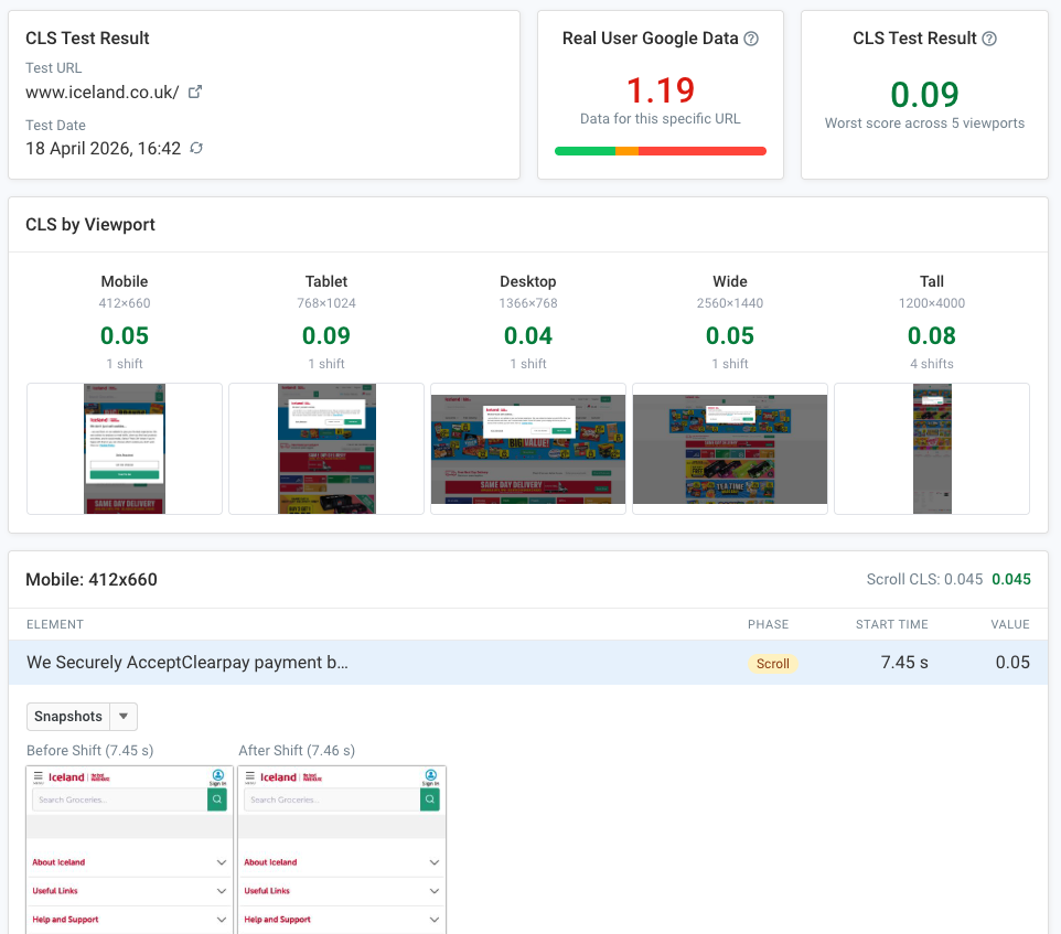
Understand Layout Shift Sources
What causes layout shifts?
Common causes include images without dimensions, dynamically injected content, web fonts changing text size, and ads or embeds that expand once loaded.
How CLS is calculated
The amount of layout shift depends on how much of the screen is impacted and how far elements move.
SEO impact of CLS
CLS is one of Google's Core Web Vitals and affects search rankings. Use this CLS tester to identify layout instability before it impacts your users and SEO.
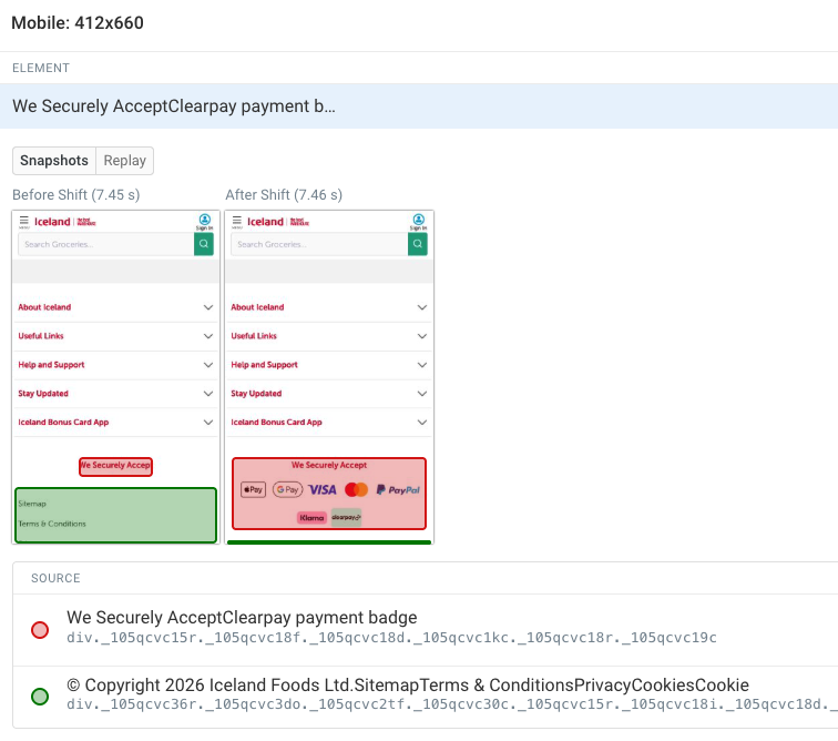
Measure Real User CLS
See how real visitors experience layout shifts
Lab tests show what can happen, but real user monitoring shows what actually happens. Track CLS scores from real Chrome users visiting your site to understand the true impact of layout instability.
Break down CLS by page, device, and connection
Different pages and devices can have very different CLS scores. Real user data lets you pinpoint which pages have the worst layout stability and whether the problem is specific to mobile, desktop, or certain network conditions.
Identify which elements shift for real users
See exactly which DOM elements are causing layout shifts in production. See what shifts you need to fix for the most impact.
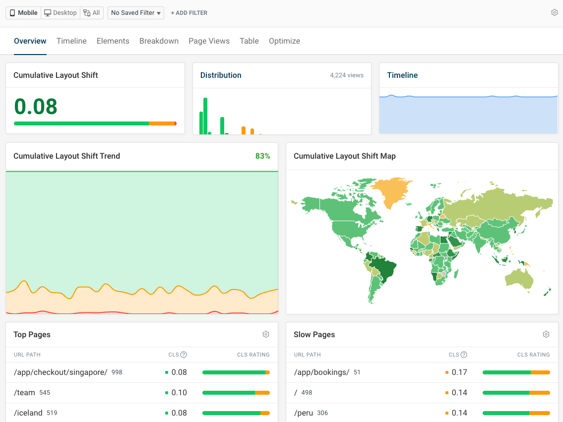
Monitor Cumulative Layout Shift Over Time
You are using an old browser that is not supported anymore. You can continue using the site, but some things might not work as expected.